You are here
- Guest Blogger |
- Management |
- Fri, 10/19/2018 - 01:18

Kristen Sosulski, Associate Professor, NYU’s Stern School of Business
With the rising popularity of data science and business analytics, skills in data analysis, statistics, and data visualization are in high demand. Big data and analytics can give firms a competitive advantage. A strong data analytics and visualization team can lead the company in transforming its data into a unique asset. However, if your company isn’t quite there, it’s not too late.
Establish a data practice
It is essential to create a well-defined data practice. Start by understanding the data you have and the data you think you need. Next, devise a series of business questions to which you would want answers on-demand, daily, weekly, monthly, quarterly and annually. Repeat this exercise with every level of management in each business area. Guaranteed, you will come up with a compelling list of questions. Work with your IT team to see which questions can be answered with your existing data and questions that may require data your company does not have yet. Consider the costs of gathering the required data. This will help you formulate a data collection plan. Build a strategy for ethically obtaining the needed information and preserving privacy. Define guidelines for data collection, use and sharing.
Create a plan of action
Determine who will have access to these new insights and how they will be used.
Turn back to the questions and determine how you will use the answers in your decision-making. Define measurable outcomes for each question. Rank and prioritize the answers that would help each business area make better and more informed decisions.
Build the culture of use
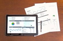
Once you have a clearly established data practice, build the culture of use. Specifically, designate champions to lead the charge in each business unit. Make the access to the data easy and manageable. Invest in an analytics platform to facilitate the building of queries to answer the salient questions. Empower data-driven decision-making by using dashboards to illustrate the top business unit KPIs and provide access to the needed information. Insist upon decisions based on facts rather than intuition. Encourage new ideas for products, services, and processes grounded in data that will support the endeavor.
Communicate results using data as evidence
In my experience, charts and graphs are often underused for internal communications within an organization. Offer training in data visualization to have business units showcase the cause and effect of their data-driven efforts. Require reports and presentations to include visualization of data as evidence, not spreadsheets. Use the questions below to guide the purposeful visualization of data and aid in interpretation and understanding.
1. What do the data axes mean?
2. What do the encodings (lines, bar, points, etc.) represent?
3. What level of detail is presented? For example, is this daily or weekly data?
4. What data points should the audience be looking at?
5. What is the key takeaway or insight from the data visualization?
Measure the impact of your efforts
Equipping decision makers with the right information is invaluable.
Track the new data-driven decisions that you can make today that were impossible before establishing the data practice. Put in place measures to verify the quality and validity of the data. Periodically, take inventory of the changes in management practices alongside any changes in business KPIs. Finally, return to the initial questions used to guide your company’s data practice. Identify new questions or problems you have begun to notice; know that the answers may lie in the data you already have.
About The Author
Dr. Kristen Sosulski is an Associate Professor at NYU’s Stern School of Business where she teaches MBA students and executives data visualization, programming and business analytics. She is the Director of the Learning Science Lab for NYU Stern where she develops immersive online learning environments for business school education.
Kristen is the co-author of the Essentials of Online Course Design: A Standards-Based Guide (Routledge, 2011, second edition, Routledge, 2015) and The Savvy Student’s Guide to Online Learning (Routledge, 2013). Her third book, Data Visualization Made Simple: Insights into Becoming Visual will be published in September 2018 by Routledge.
As a leading expert on data visualization, Kristen regularly consults, delivers seminars, and leads workshops on data visualization techniques and best practices. You can find her speaking on the subject at events like Social Media Week NYC, plot.ly’s PlotCon conference, and Tableau’s events and to organizations like the National Association of Public Opinion and the National Economic Research Association.
Kristen’s passion for technology and learning sciences converges in all facets of her career, inside and outside of the classroom. Follow her on Twitter at @sosulski and learn more at http://kristensosulski.com.
Follow The Blog
Blog Categories
- Business Ops. (45)
- Editors (3)
- Entrepreneurship (196)
- Finance (25)
- Leadership (529)
Blog Authors
- Guest Blogger (835)
- Cynthia Kay (92)
- Linda Henman (78)
- Dianna Booher (46)
- Craig Ross (31)


